
Epod, Univar solution’s very first mobile app.
I did: Product Design, Design System, Creative Direction.
Created for truck drivers to streamline signatures and load check ins in order to deter the influx of disputed orders. We had an opportunity to build something that didn’t exist in this industry. I wanted this app to look different from our other products. To have fun with it, take a creative twist in an old school industry.

my role
I was given full control over the user interface of this high profile project. Working alongside a UX Architect I created the entire UI design system for this app. Then working closely with Devs, I facilitated the entire implementation of the designs until launch.
I will walk you through my process in the design choices I made for visual design, some iterations I made in collaboration with Devs, and the end result of this ongoing project.
The problem
Many of Univar Solutions customers (large companies like Revlon) will sometimes dispute orders and refuse payment due to missing signatures and legal documentations necessary in chemical delivery. This system has always been done by paper and pen. We decided to take it digital.
ePOD is the incredibly high profile, very first app created by Univar Solutions (an international chemical distribution company).

It didn’t start user friendly…
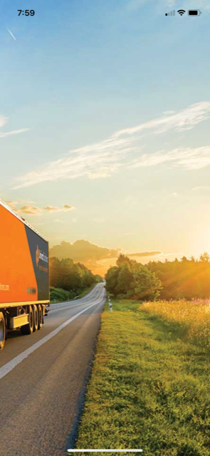
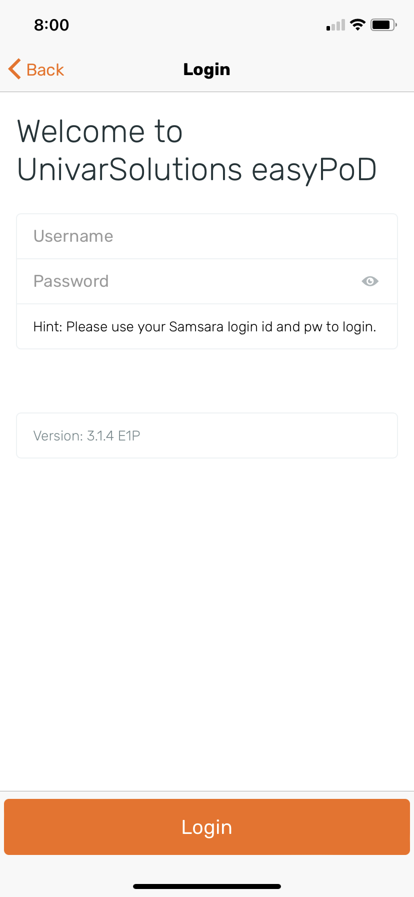
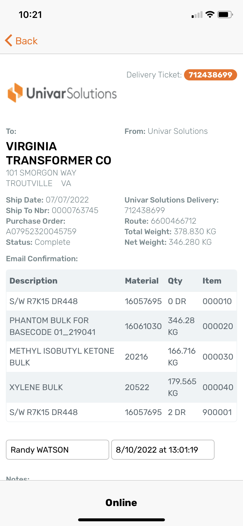
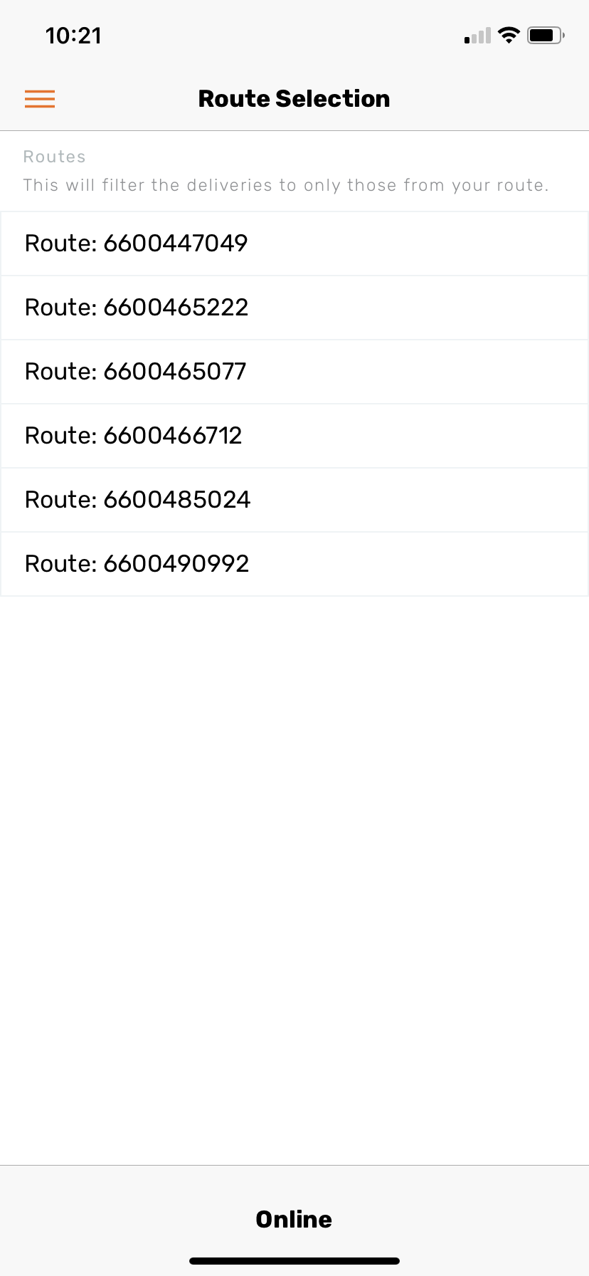
The app started with one of our Devs making an initial concept design. Needless to say, it wasn’t the prettiest or user friendly. Our UX Architect whipped up some wireframes and handed it over to me, and I was asked to create an entire visual design system for the app.
Some of the wireframes that were handed off to me
My Process
I always start my process my establishing what we know about the user and the requirements of the project. These are the must-haves, must-do in creating entire system.
-
Majority male (account for large fingers), all truck drivers, not very tech savvy
-
On the road, in warehouses, with our customers.
-
Be simple, easy to use, follow our brand guidelines and include the Univar orange. I was given full creative ownership.
-
Not a lot. 2-3 months a most to create a whole styling and get it implemented and refine.

I listed the functionalities of the app and tried to assess similar industries for inspiration and component designs:
Delivery Services
Product Descriptions / Editing Tools
Delivery / Document Signing
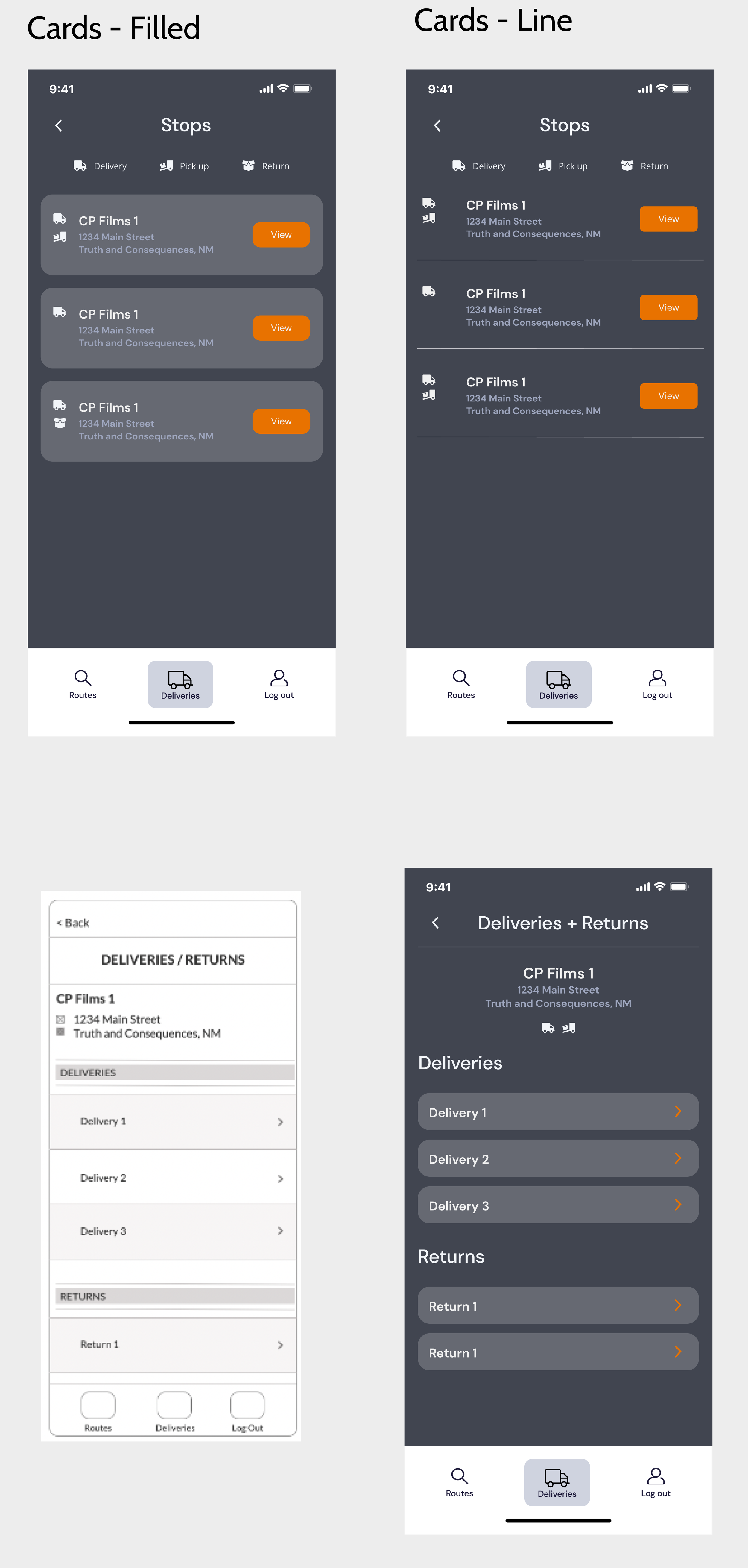


Some concepts, some ideas.
Dark mode since drivers would be in dark warehouses. Big cards, big buttons.
Clean, simple, I looked into ergonomics and played around with back button on the lower right hand side closer to their thumbs,
This one was just me having fun with it. Trying something out of the box. The curved bottom and header I liked a lot. I made the app less intimidating.
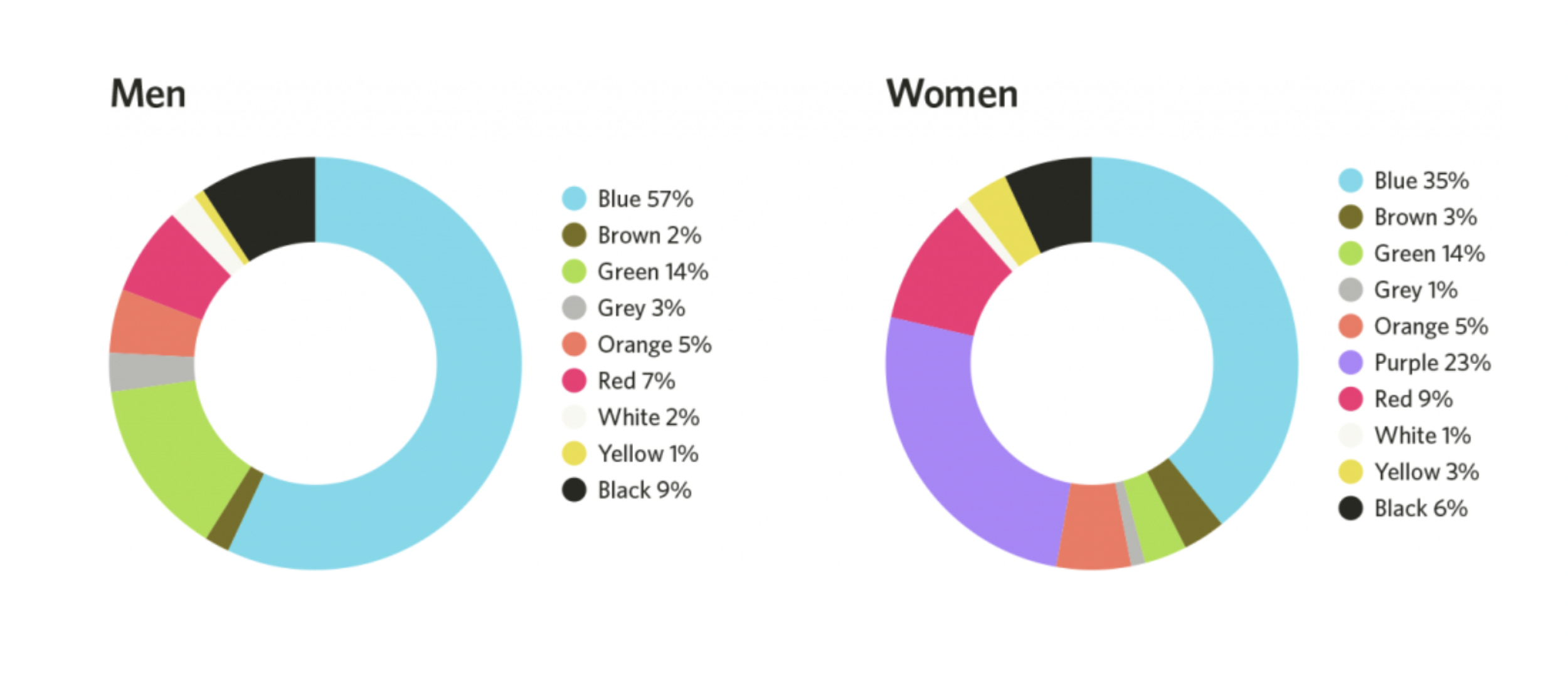
The former researcher in me, looked up what colors resonate with men and women, I found this in an article and it turns out blue resonates with both genders.
at this point, i knew I had to incorporate this blue.
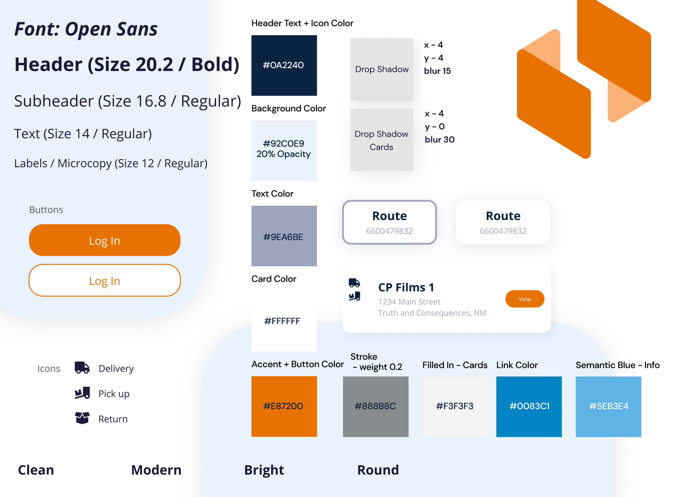
I created a style tile as I closer to the final concept. Establishing the design feel, look and colors (this would come in handy for future designers working on this project)

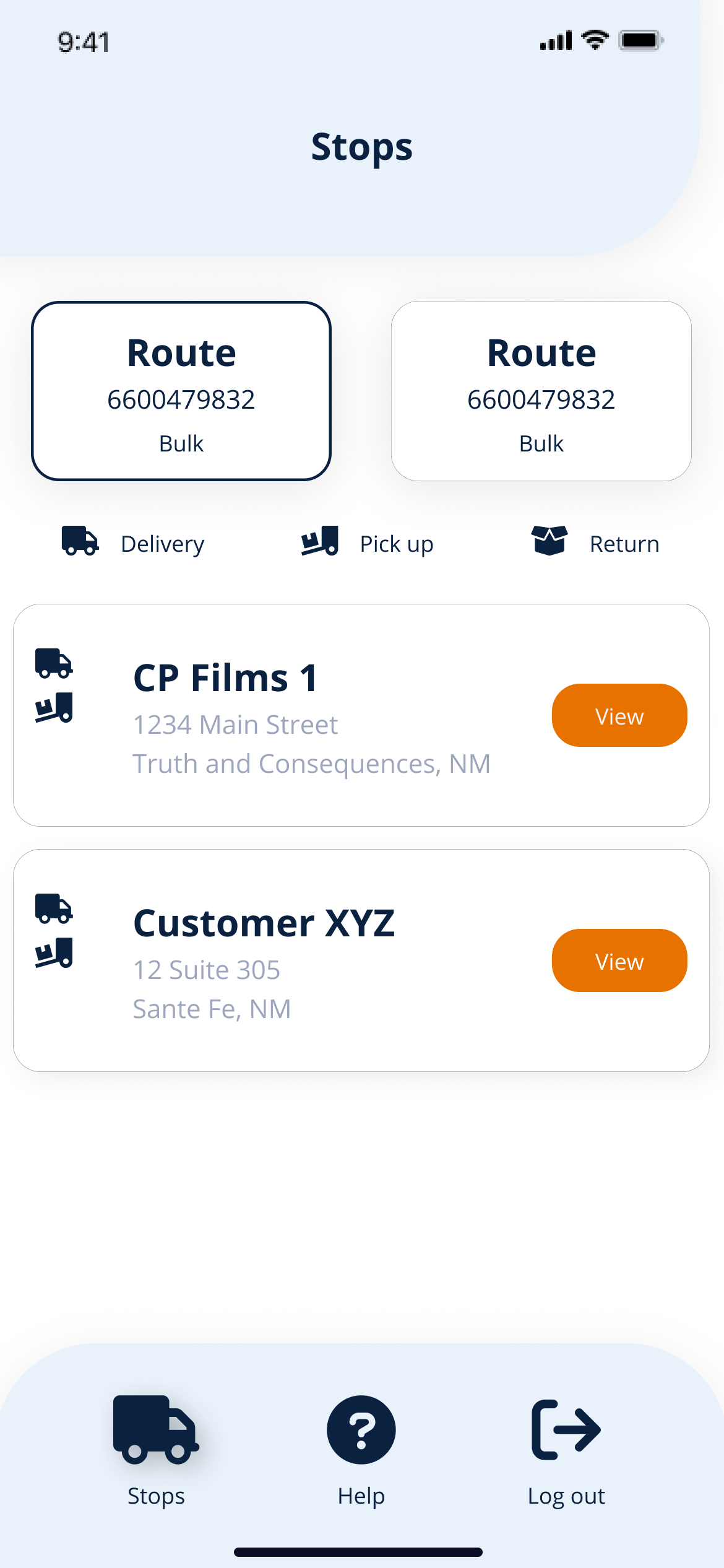

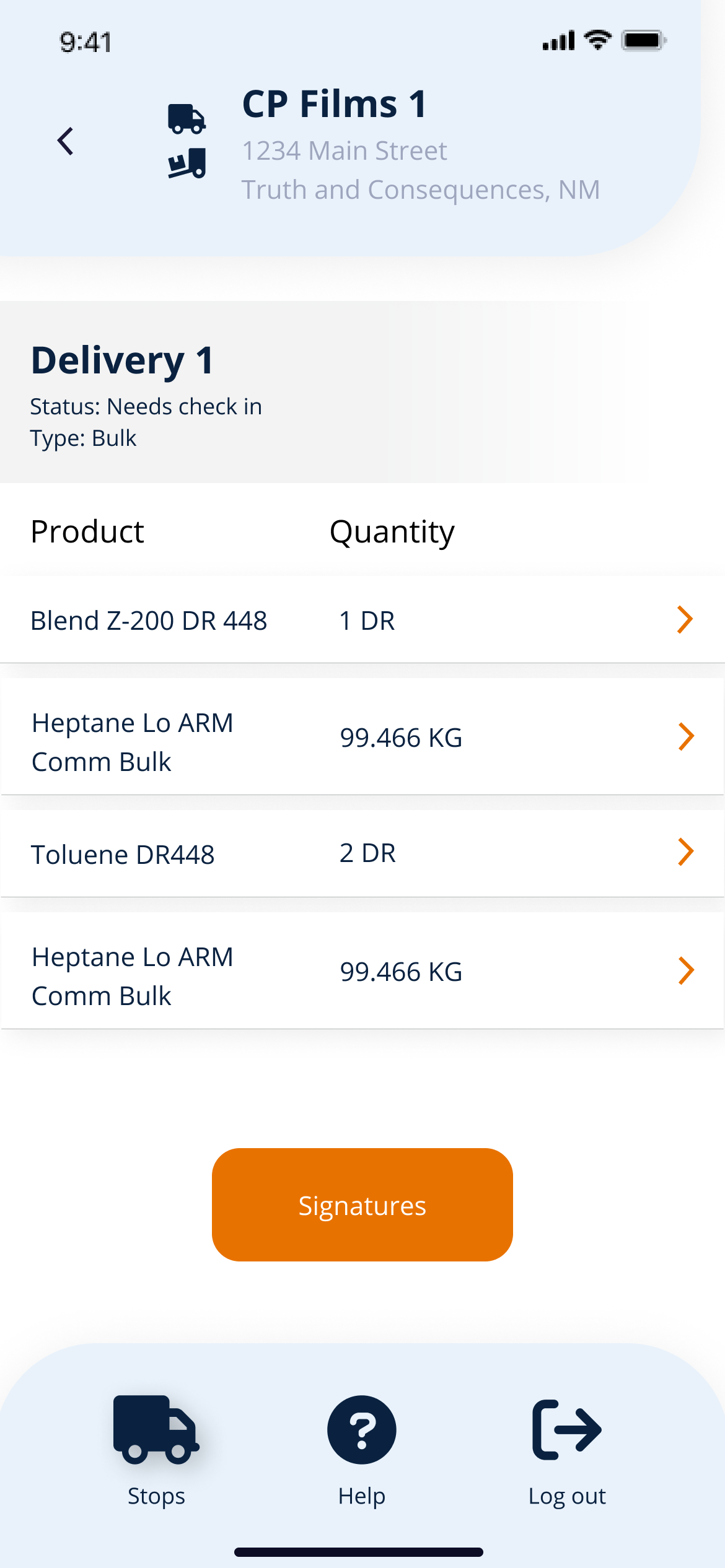
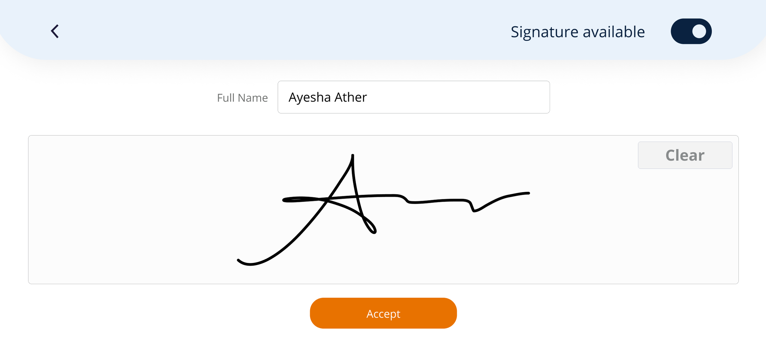
The concept came to life and these were the final designs.
What’s next?
The reception of my designs was really great. Our VP of Digital Digital used it to present ePOD to our CEO. It was called brilliant. I worked with the entire Dev team to implement these designs and made sure we stayed consistent with our styling. We launched ePOD with out first round of users in Oct 2022. We made some iterations based on the feedback we received and will continue testing into 2023.
There’s a lot more to this story my decisions and my process, connect with me so we chat about it!
