Spotivity
A dual-sided platform serving teens and parents after school programs, as well as connecting program providers to teens and parents.
The Process
I was working on a team of UX and UI Designers to redesign the agency onboarding flow.
The Challenge:
I was tasked with developing and improving UX copy for each screen to make sure users are able to understand the value proposition of the product, learn how to leverage Spotivity’s tools for outreach, retention, and promotion of their objectives, and guide them through onboarding
Approach
I started by conducting user testing to the current existing copy and exploring an understanding of what terminology and language agencies and program providers use After identifying painpoints, and our project scope, we developed wireframes, and I implemented incremental changes on existing copy while developing new copy for new screens.
When I wrote copy, I focused on using the same voice I found on the existing website, the terminology of our users during our interviews, and abided by brand and design principles.
Design Principles: I used these design and brand principles to develop copy that honored each.
The Discoveries
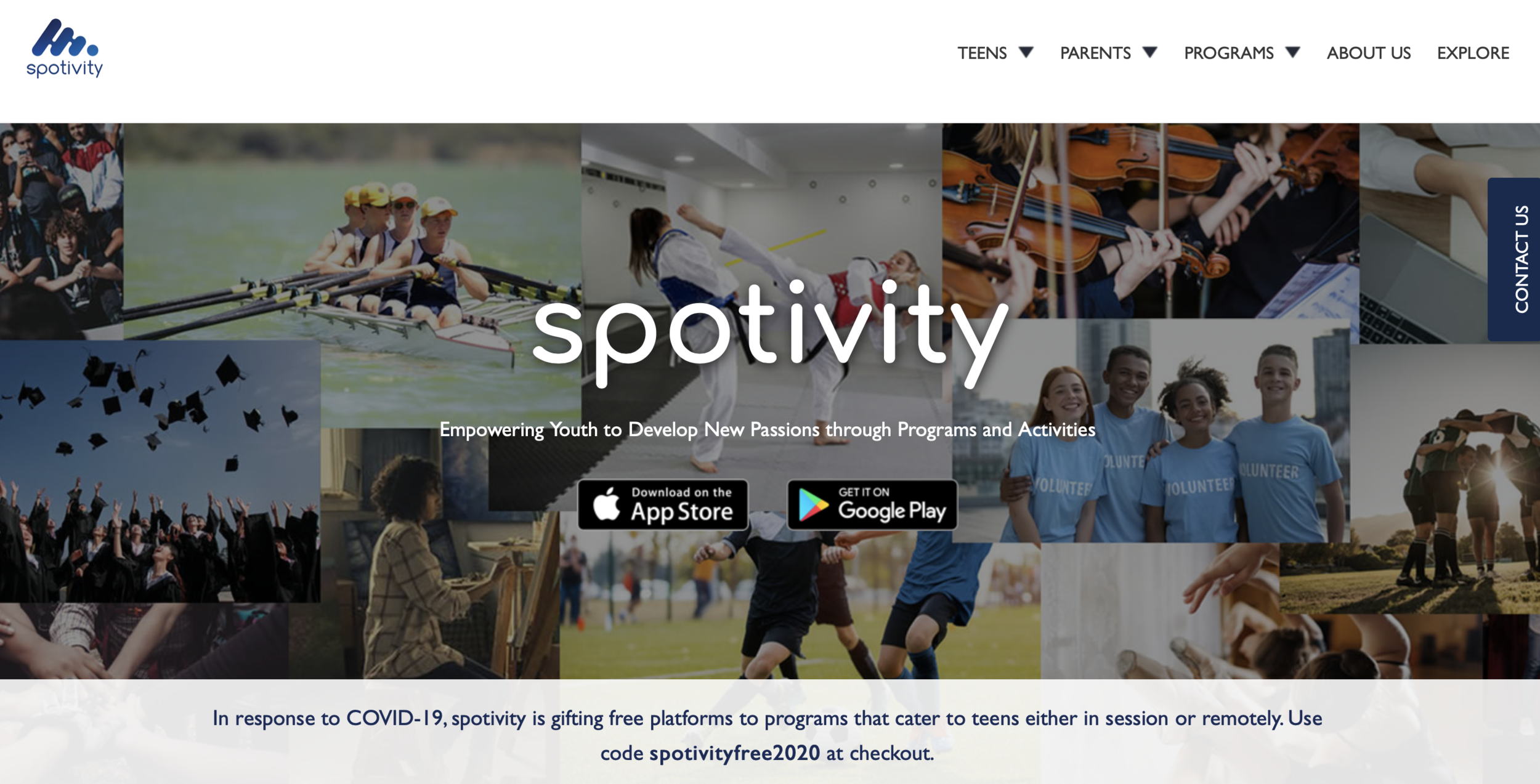
homepage
Defining the problems
The product currently did a poor job of conveying the value proposition for the secondary user base: program providers and agencies. Many of our users didn’t understand what value it provided for them.
If a program provider some how clicked on the ‘Programs’ tab on the upper right, they were immediately taken to the plans page, which listed the pricing options and features.
plans page
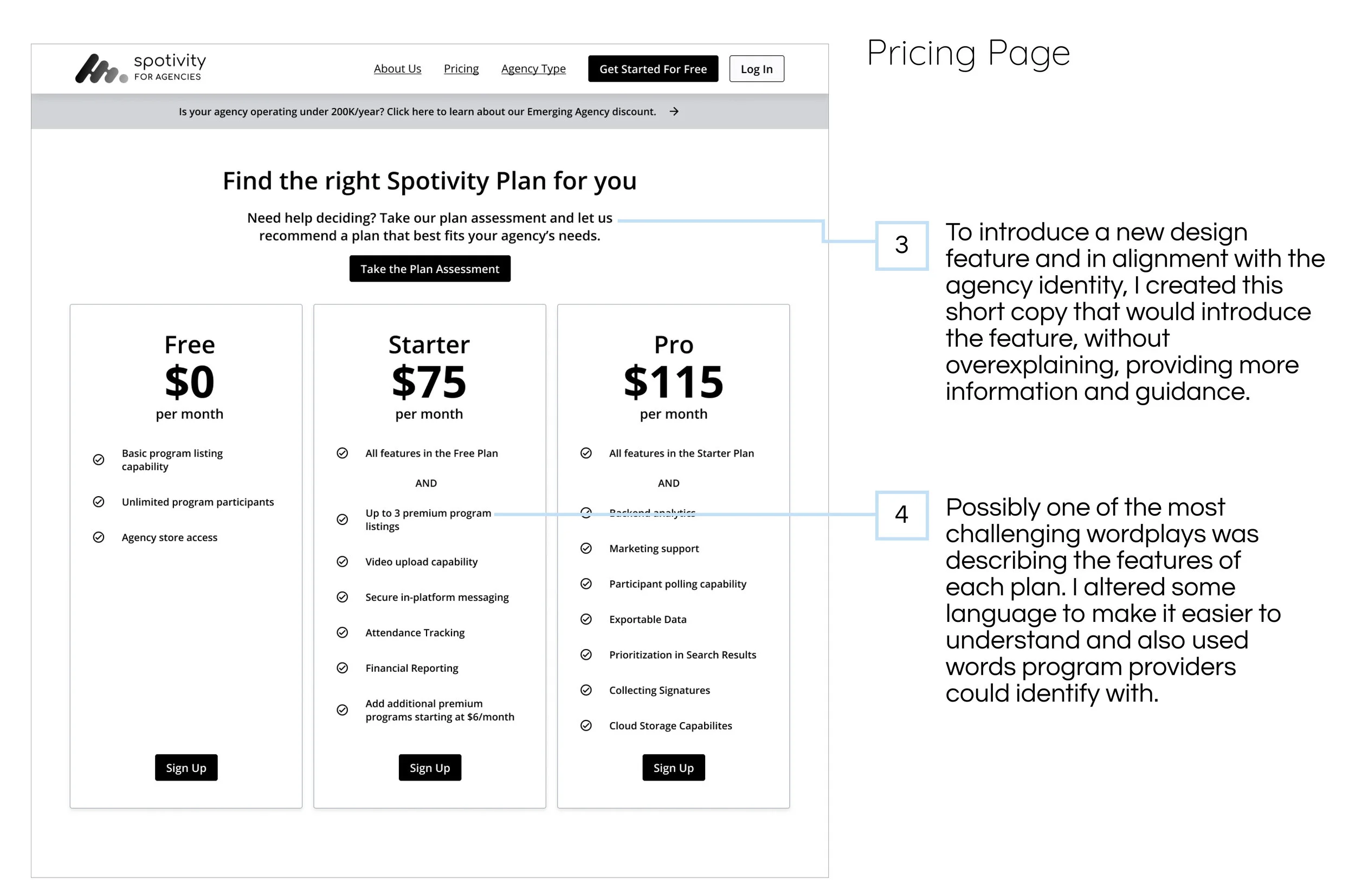
The plans page also lacked clarity, it did not provide context, information or guidance. A lot of words were used interchangeably, words lacked meaning and were not clarified.
ux Writing: information and guidance
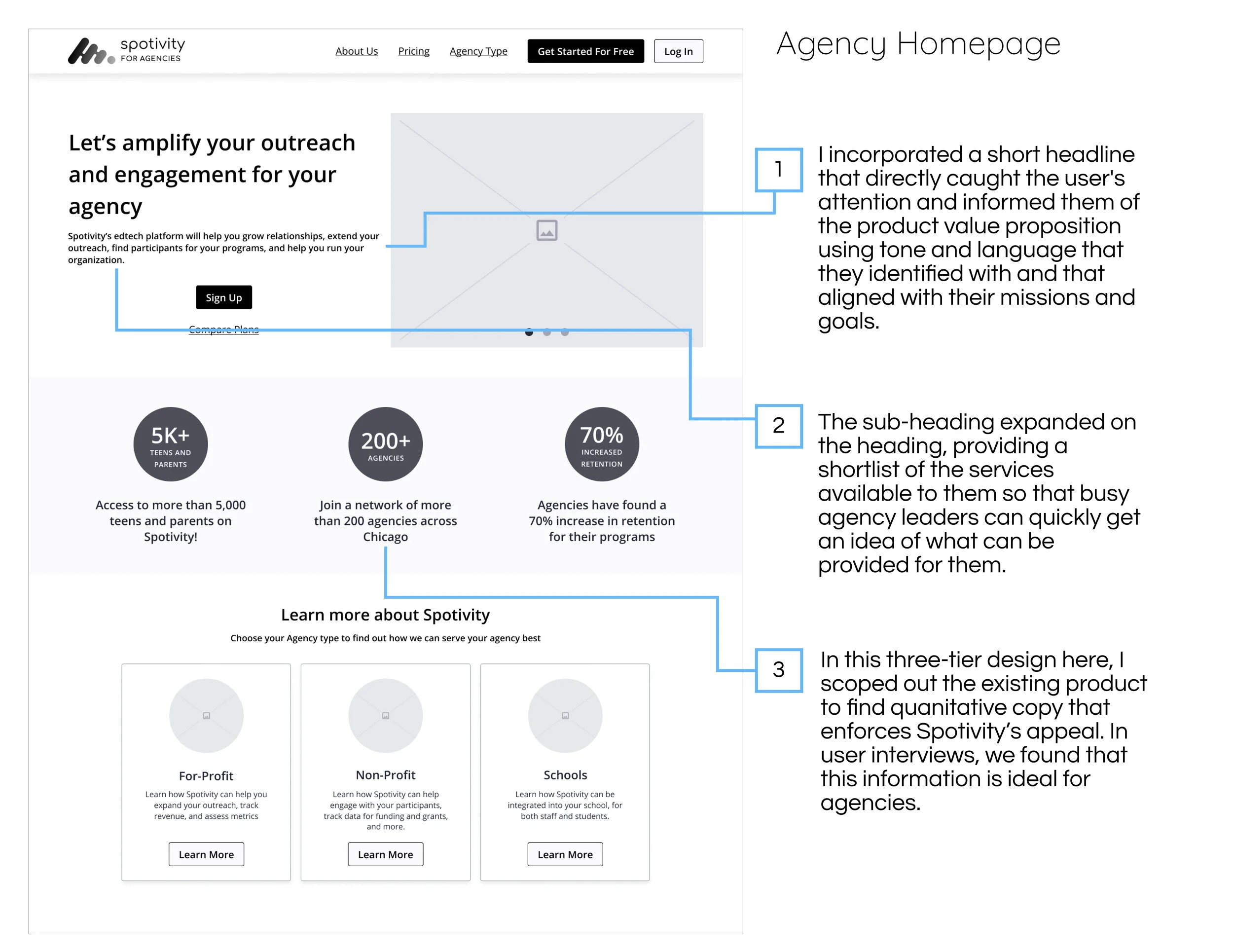
The copy I developed alongside wireframes, honored our design principles and also addressed the problems of lack information and guidance. Below are the changes I developed and copy I created.
THE OUTCOME
The copy has been implemented into high-fidelity design, and user testing resulted it 90% increase understanding and efficiency. The entire redesign shifted the product’s structure and emergence as a dual-sided marketplace.


