ux strategy
ux research
ux design
ux strategy ux research ux design


Agiloft, Agreements and Vendor Management tool
UX improvement on an enterprise SaaS application
at Brookfield Properties one of the largest alternative real estate asset managers in the world.
What is agiloft?
my role
Agiloft is a contract lifecycle management and business process management software service. Brookfield Properties was using Agiloft to create and manage legal agreements for vendors across the Unites States. These forms included NDA’s, service contracts etc.
I led this project from start to finish over 3 weeks.
I was UX strategist, UX Researcher and UX Designer working with Agiloft users and stakeholders to develop Mid-Fidelity wireframes.
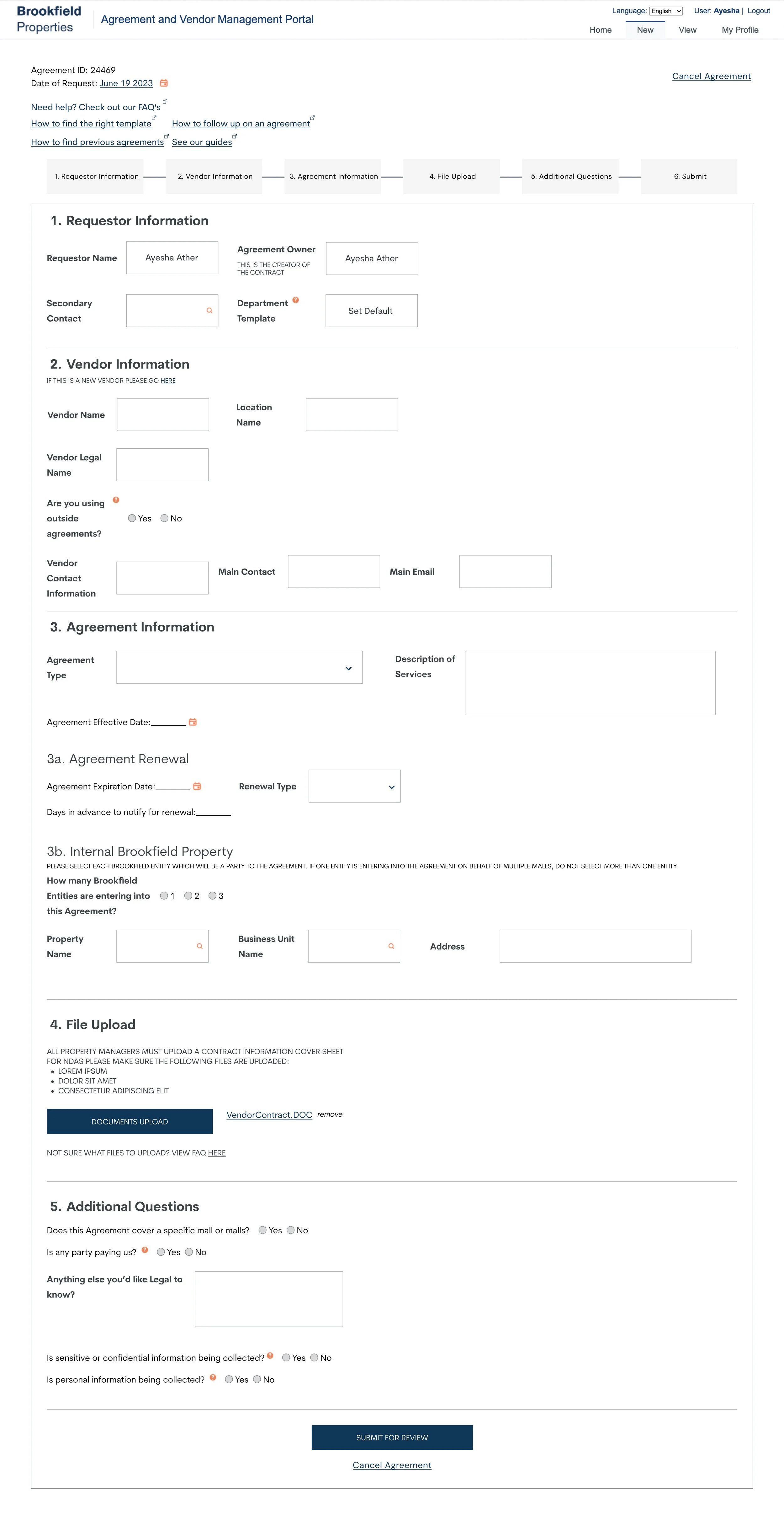
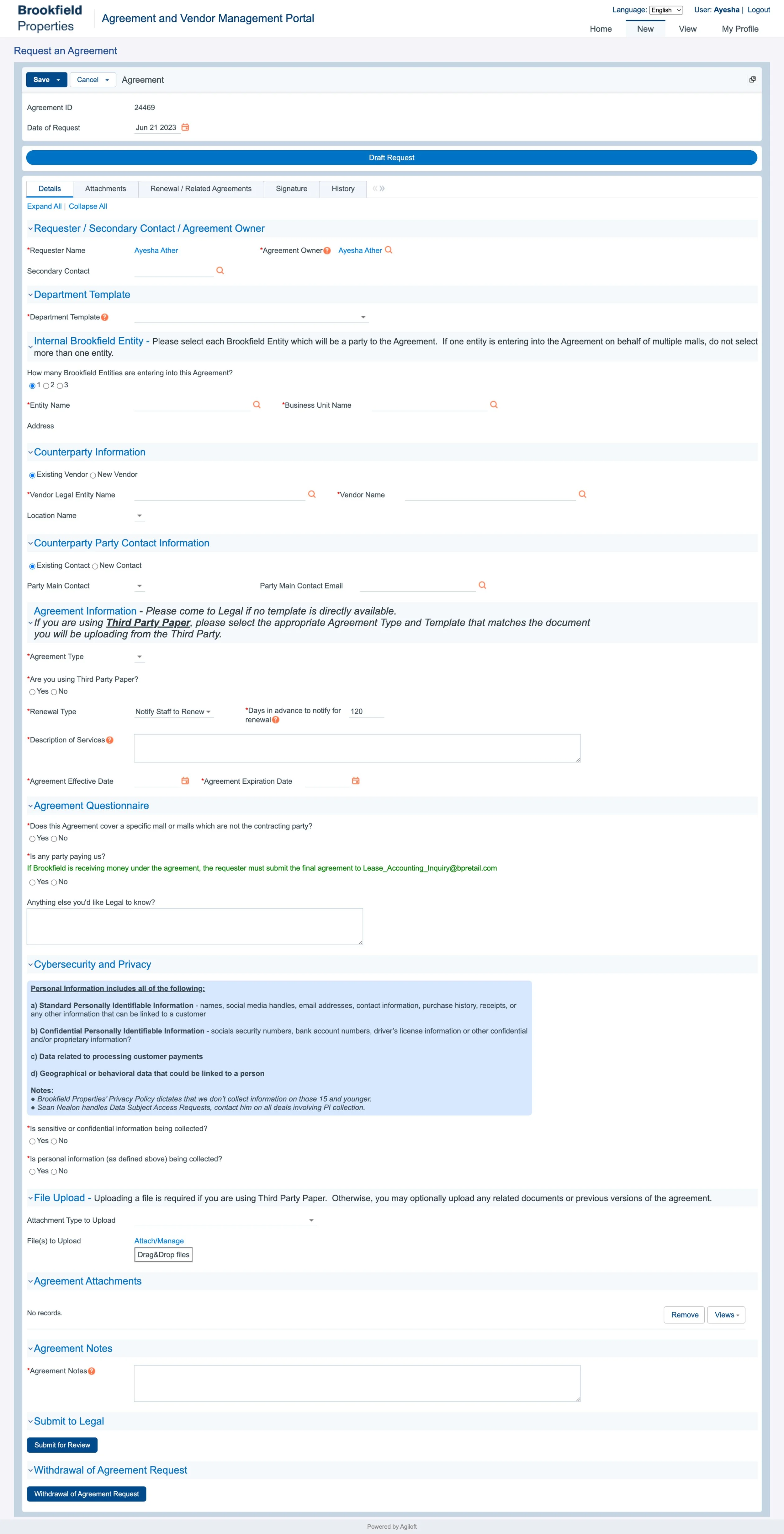
Existing form: flow was confusing, nomenclature confusing, not user friendly.
My redesign: redesigned flow based on findings from interview, fixed nomenclature, improved file upload feature, regrouped sections for clarity, added a progress status bar, reformatted fineprint text.
Getting to know agiloft, quickly.
There were many components to the Agiloft software. When the project was first introduced to me by IT owners, a few business objectives were shared with me:
Improve Agiloft to be the singular platform for contract creation and life cycle.
Currently: High rates of user error on high liability contract forms.
One of the biggest struggles for me was understanding this complicated software in such a short amount of time. After a few walkthroughs I established a project context to help, you can see my notes below:
“Project Context (Scope of Work):
Agiloft is a contract creation platform that allows Brookfield (both corporate and field) employees to create agreements for vendors. There are two parts to this platform:
Vendor requests: This is the onboarding of new vendors Any third party that needs issued a payment (includes software, etc) Parties we will need to do business with, and we need to PAY. Requests are sent to Accounts Payable.
Agreement Request*: This is the creation of a contract between BP and a Vendor. Requests are sent and reviewed by Legal within Agiloft as well. The current UX/UI of this portal is complicated with many user experience issues.
Due to the limitations of our timeline, we were focusing UX improvements on the latter 2. Agreement Requests form and experience.”
My Process
I always start my process my establishing what we know about the user and the requirements of the project. This includes technical feasibility, user profiling, initial UX issues etc. For this project, I deemed it necessary to do UX research since IT leadership had never spoken to users before, I gather all this information and leverage it into a UX Planning document which sets us up for success when we move into UX Research.
-
The Primary User Groups:
User group 1: Users who initiate and fill out a Request Agreements form. These are regular BP employees.
User group 2: Users from the Legal team who receive these Requests.
-
Since we don’t entirely own this portal, technical feasibility is limited. We cannot completely re-do the UI, but we are able to make UX improvements.
-
Not a lot. 3 weeks at most.
-
It worked with IT leadership who owned the portal and two developers. We had regular meetings to align on deliverables and outcomes.
starting with Ux Planning
After establishing all the variables that were handed down to me by leadership, I created a UX Planning Roadmap that would lay out the deliverables for the days ahead. This tool is helpful to get alignment from stakeholders and visualize a path ahead.
User Interviews/Moderated Usability Testing (1-3 days)
Followed by findings synthesis and recommendations (1-2 Days)
Agreements Form Audit (1-2 days)
Mid-Fi Wireframes (1-5 days, with check ins and iterations)
moving into User interviews
I also created a UX Research Planning document that contained research questions which led to the development of user interview scripts.
Due to how quickly we moved, I interviewed 3 users from both user categories and both sides of the experience: Requestors and Legal Team. With these interviews I wanted to keep the interview questions as open ended and let user guide us into where we should focus improvements.
Some questions for User Group 1; Requestors included:
“Can you walk me through how you would start the process to request an agreement?
“Can you walk me through how you would go about attaching a document?” <— In earlier discussions we knew this part of the form was a painpoint. The set up was confusing and did not behave according to industry standards. So we had to see for ourselves how users were using it.

We also asked requestors if they used these tabs at the top of the page.


Collecting ux recommendations from ux research
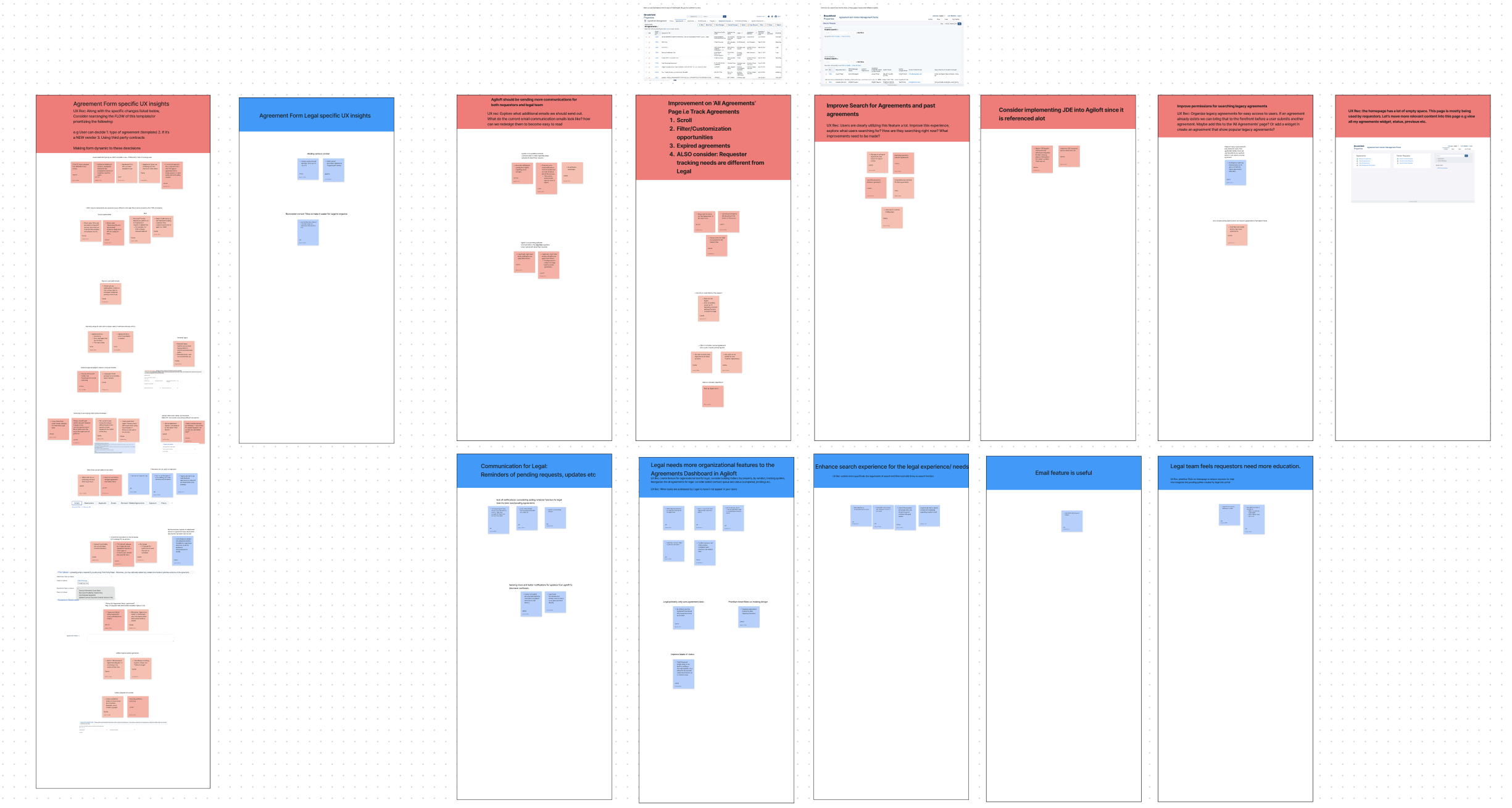
I use a workshopping tool called Affinity Diagraming to organize and retrieve insights from large sets of qualitative data. This is a helpful visual tool and creative way to organize insights and is also a great visual tool in sharing insights with stakeholders.
Main insight: rearrange the FLOW of agreement template.
After 6 interviews of both user groups, I had so many great insights to work off of when we moved into design but the main overarching theme was we needed the entire flow of the form needed to be improved. I also left a documentation of additional improvements for future projects. Some of the most insightful findings to consider in that were:
UX Finding: The form is needs to be Dynamic to which template to use + if third party contract is being used
“Not sure if Vendor Request is needed first or if Agreement request is needed first. For example, for NDA is Vendor Request needed?”
—Camie B. Marketing
2. UX finding: the Vendor information section is distrupting the entire experience of the form.

“ This form only works if a vendor already is our system. Do other people know this?”
—Jazmine t. accounting
3. UX Finding: The form needs to have more guidance and instructions relevant to agreement type.

“ a lot of people forget or don’t know to Upload the actual documents we need. Sometimes, Legal must reach out to ask for additional documentation or details..
—Jessica t. legal
4. UX Finding: removing or rearranging unnecessary legal jargon.

“it’s Not useful to have instructions about different parts of the process, such as Cyber Review in the middle of the form.”
—Julia f. marketing
leveraging
insights for wireframes

Designing the mid-fi.
Due to time constraints and technical limitations from Agiloft, we agreed to design up to Mid-Fi Design only. This allowed me enough time to provide sufficient designs that the development could work off of quickly. Although a UI redesign would have been ideal.


