Spotivity
EdTech platform connecting teens to after school programs, and program providers to teens and parents.
THE PRODUCT
I worked on the existing web design, over 4 weeks redesigning existing screens and developing an entirely new onboarding experience. This GIF is a the completed mid-fidelity prototype.
THE CHALLENGE
THE Outcome
Program providers needed a structured design to understand Spotivity’s value proposition while learning how to leverage Spotivity’s tools achieve their objectives before they are guided through onboarding.
After rigorous research, testing, and pivoting our focus, our team redesigned the Spotivity homepage, the program providers page, and created a guided onboarding experience.
Our design increased usability by 90% and was integrated into the current website.
my role
I was a UX Researcher, Designer + Writer, alongside a team of 4 brilliant UX pros.
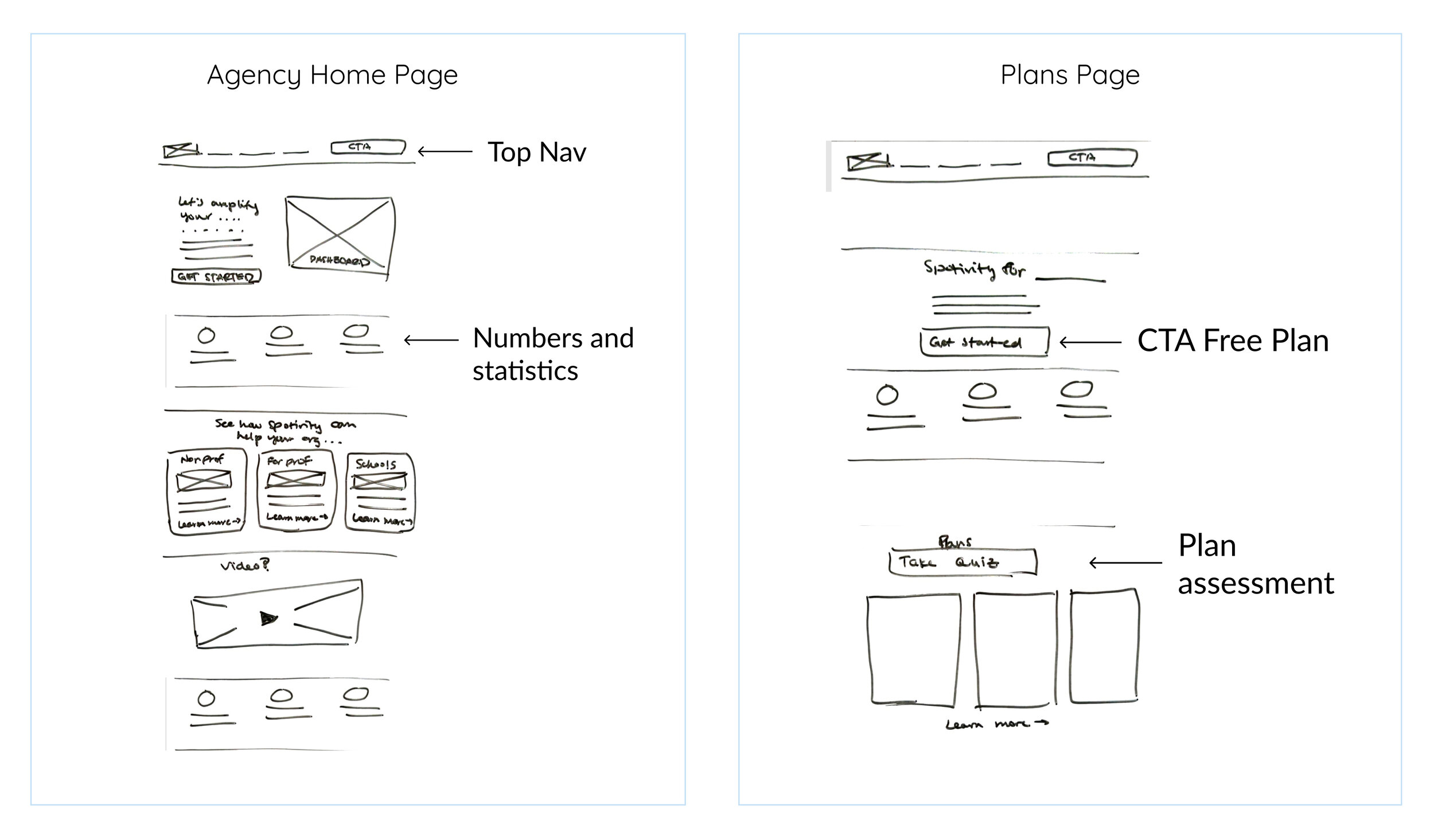
paper > low-fi > mid-fi
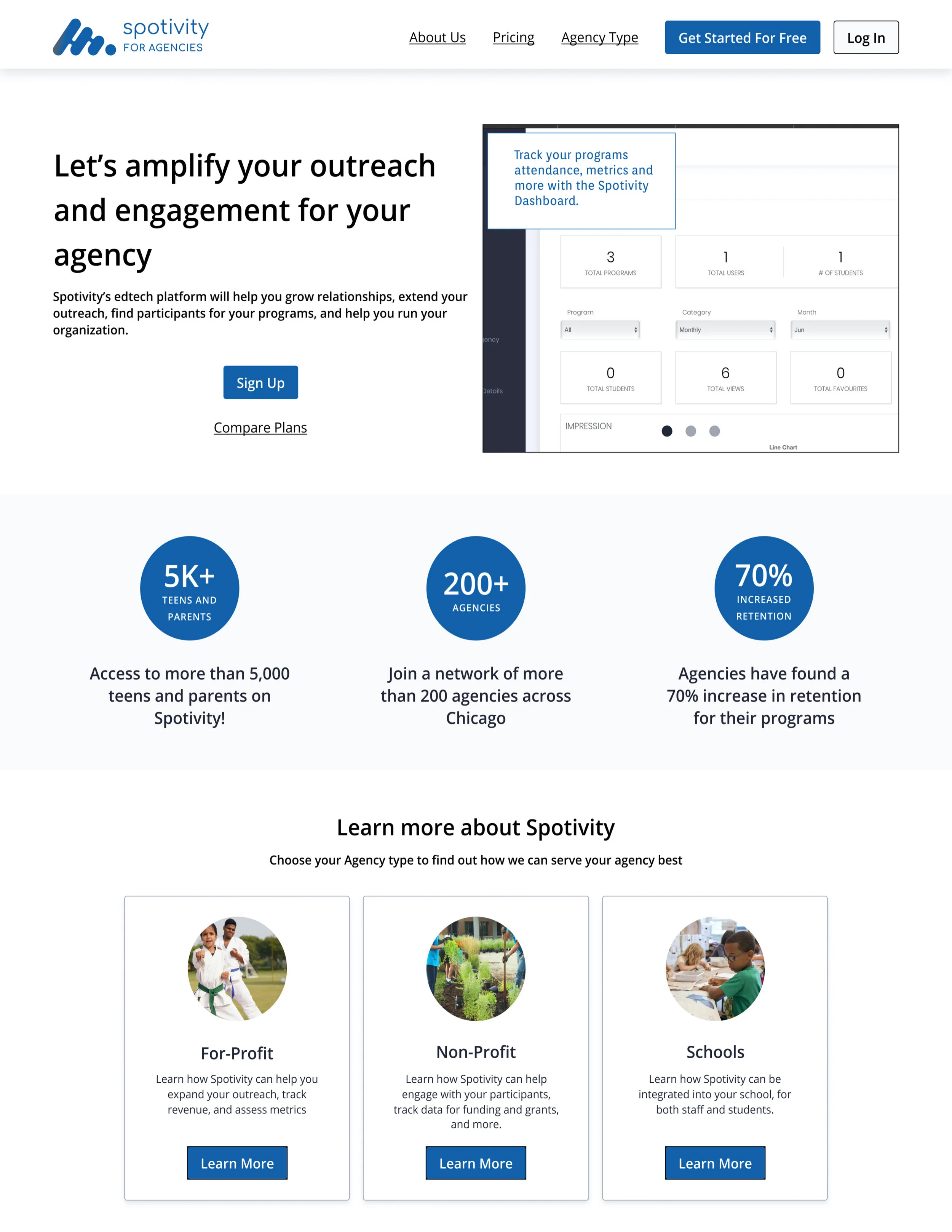
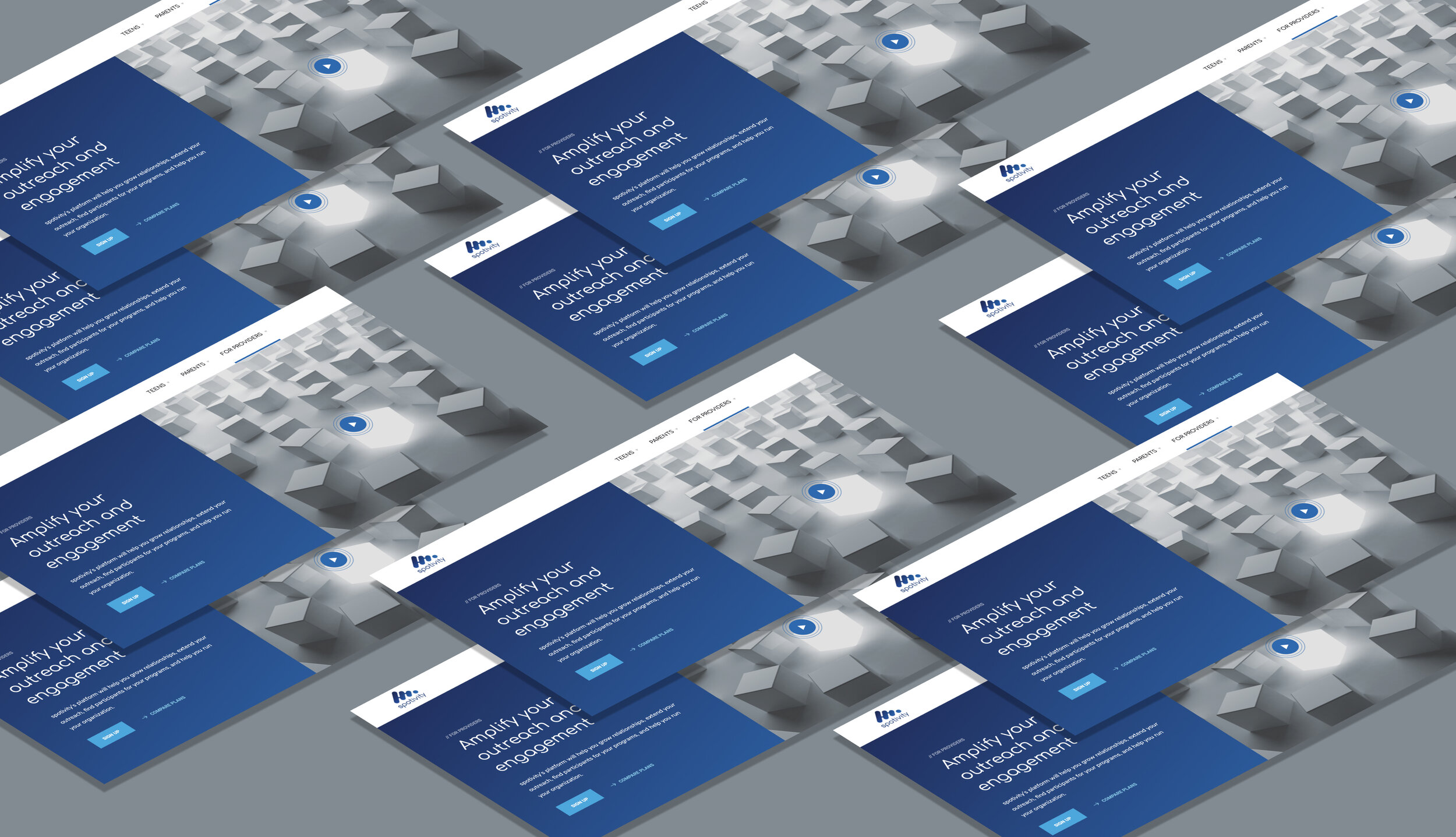
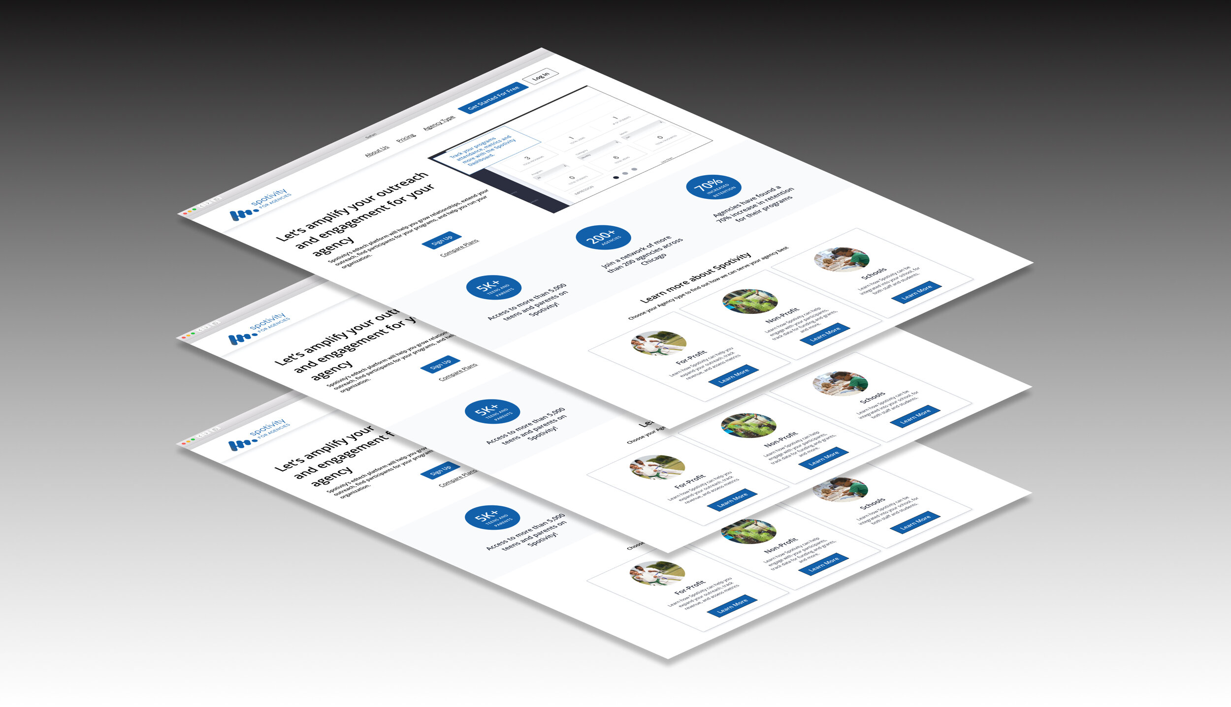
before
The existing design was difficult to read, didn’t sell the value proposition of the product, and did not guide the user through onboarding.
during
Over a series of usability testing, concept testing and ideation we created low to mid fidelity prototypes.
after
After testing we handed off a mid-fi prototype to the client and their dev team.
The Approach
Discover
Heuristic Analysis
Competitor Analysis
User Interviews
Usability Testing *1st
define
Problem Statement
Design Principles
develop
Paper Prototype
Lo-fi Prototype
Concept Testing
deliver
Mid-Fi Prototype
Usability Testing *2nd
Annotated Wireframes
Initial assumptions
We started by establishing initial client and team assumptions. By establishing assumptions, we could explore the problem without bias and also explore our biases. These assumptions included:
The client suggested a focus on improving the internal dashboard
The client suggested that there was lack of interest from providers
Lack of information architecture and organization
In the intial meetings, Our client emphasized focus on this internal Dashboard. After discovery, We would discover a shift from this assumption.
Discover
Before we started designing, we needed to explore the problem. We conducted the following research methods to discover accurate problems with Spotivity’s existing platform, identify the needs of their users, and pinpoint the best practices of competitors in this space.
heuristic Evaluation
Competitor Analysis
2-Sides in 1:
Platforms such as OpenTable have a visual representation of the two audiences on the platform and guided users to choose one of the pathways to start their journey in that role.
Value Proposition Hierachy:
Platforms such as Airbnb, use minimal hierachy to convey their value proposition, this gradually conveying useful information, while avoiding information overload.
user interviews
Leveraging Miro, we digested and organized all the data we had collected into concise insights.
A Shift in our Scope:
We discovered the true scope of the project was NOT in improving the internal dashboard but it would be to improve the ‘pre-onboarding’ experience. This meant everything came before the internal dashboard. Agencies were having difficulty understanding what Spotivity was all about. This prevented them from onboarding at all.
62% of users did not find Spotivity inclusive for their identities.
100% of users said they struggled with outreach and suggested they would use Spotivity for outreach specifically.
75% of users found the dashboard already useful and familiar.
62% of users said that they could not understand what Spotivity could do for them.
define
Although, our client still emphasized the value of the internal dashboard, we were able to explain our shift by enforcing Our research and data. The client was fortunately assured by our DECISION and we moved forward as we defined the problem.
problem statement
Agencies need an organized and digestible way to understand Spotivity’s value proposition during the pre-onboarding experience on the platform so they can better understand how to leverage Spotivity’s tools for their objectives.
We shared our insights with the client and aligned on this precise Problem Statement.
Design principles
Develop
Now that we had defined the problem, we leveraged our design principles and research insights to develop divergent concepts.
Ideation
Each concept attempts to solve for all our findings, each concept gravitates to solve for distinct problems guided by particular design principles. We assessed the components through concept testing and used the the validated designs.
concept a: Organized Hierarchy
This concept incorporate a distinction of the dual sided by Seamless Guidance. A button at the top right leads users to the Agency side.
Concept c: Step by Step Onboarding
This concept amplifies Seamless Guidance by integrating the entire onboarding process through guided navigation.
concept b: Navigation by Identity
This concept attempts to provide a solution by honoring Agency Identity in allowing agencies to navigate the website according to their identity.
We incorporated these components and merged them through a series of workshops until we achieved the final MVP.
deliver
We developed mid-fi designs, conducted a second phase of testing and annotated wireframes to handoff for development.
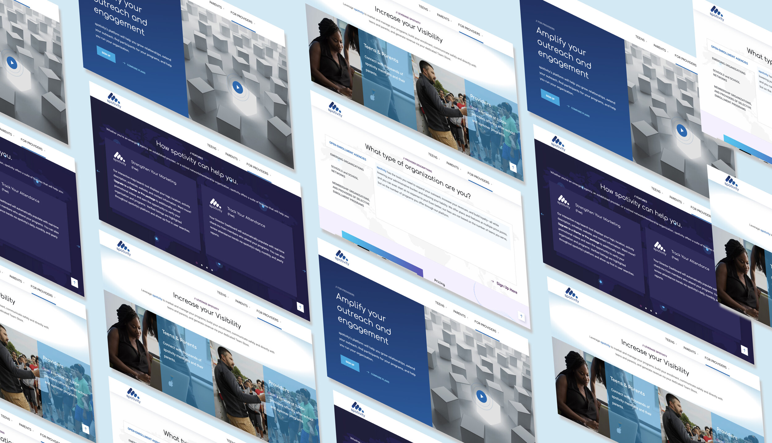
The Mid-fi design
This was our Agency Homepage Mid-Fi. We prioritized exemplifying a dual sided marketplace, dividing navigation by agency identity and separating pricing. Thus allowing users to understand Spotivity’s Value Prop before they were recommend to buy.
For the Pricing page Mid- Fi, we included a plan assessment feature to allow users to further understand plans, and find a suitable one for their agency’s goals.
Usability testing
We tested a series of tasks to assess the following qualitative and quantitative metrics:
1. Completion of task
2. Number of divergent paths taken while completing task
3. Number of errors


