
Spotivity
igniting passion in youth with edTech
Role: Project Timeline:
UX Research 4 weeks
UX Design 3 Sprints
Project Management 3 Phases User Testing
The Client
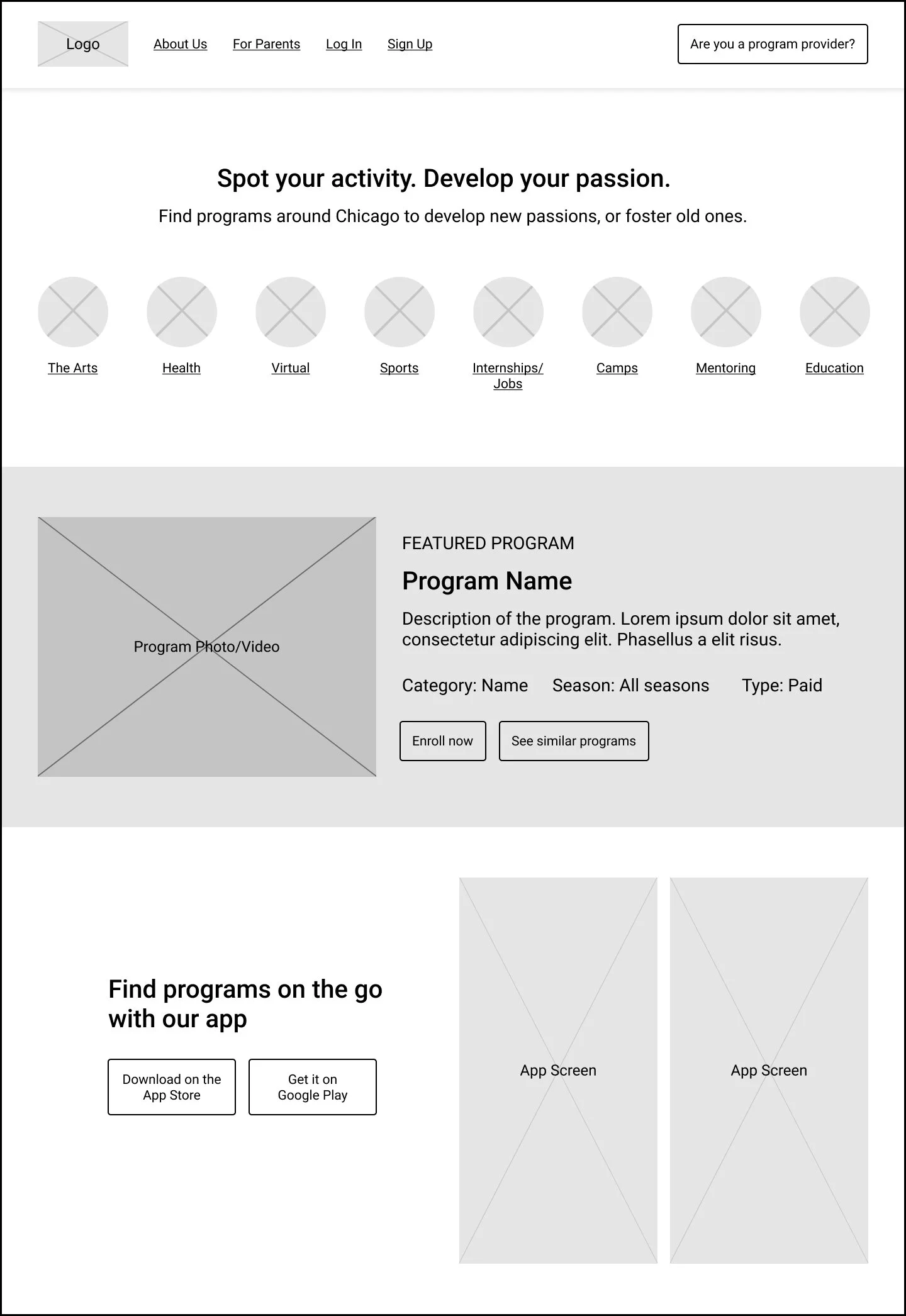
A dual-sided platform that simplifies the process for teens searching for after school programs, as well as streamlining outreach and engagement for program providing agencies.
The Challenge
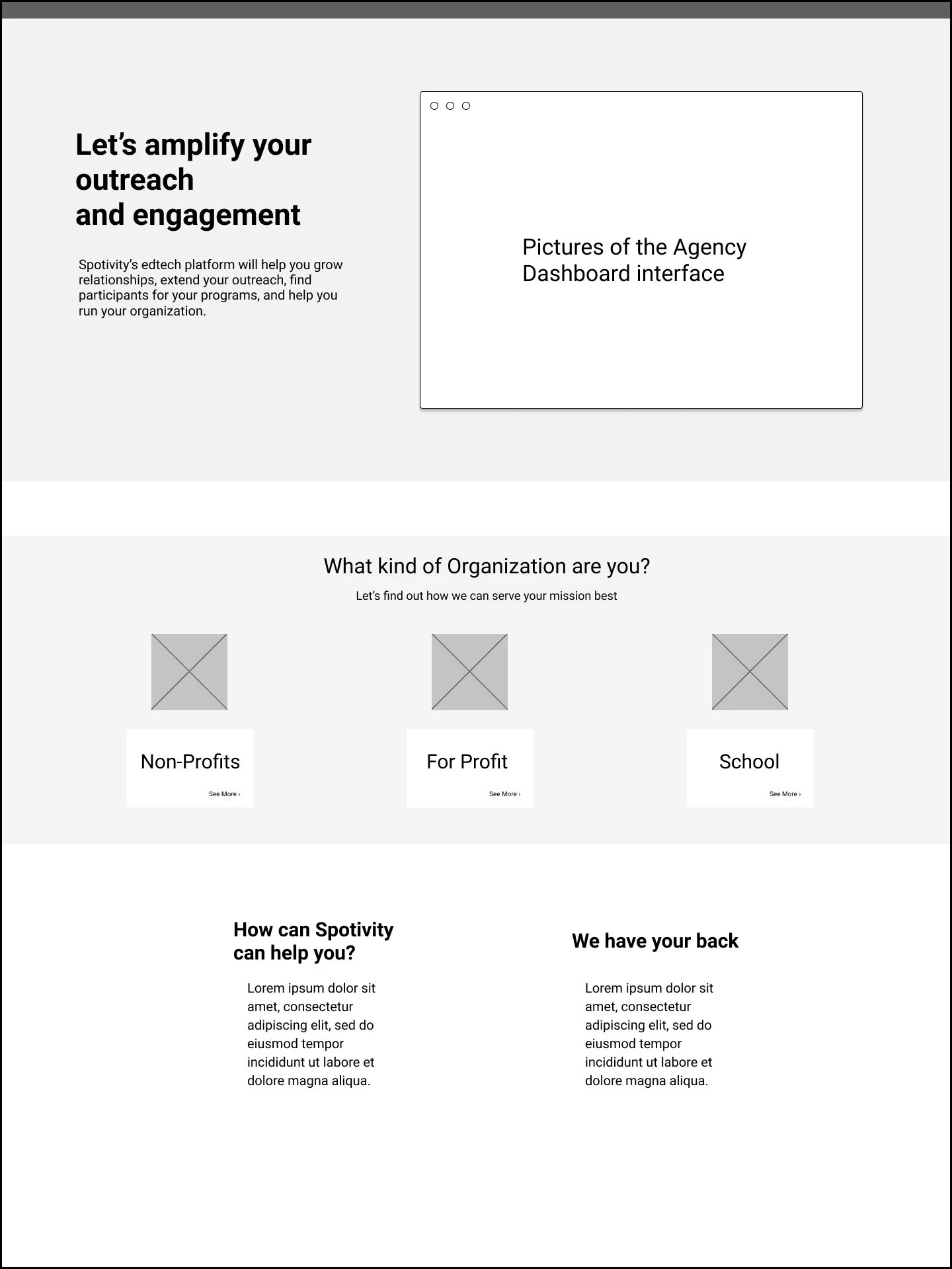
Building off the existing website we were asked to exemplify a dual-sided platform to improve the agency-facing side of the Spotivity.
The scope: vast and vague.
Breaking down the problem: start by establishing assumptions.
In our initial meeting, we established a few assumptions before diving into research. By clarifying assumptions, we can validate or invalidate insights and identify an accurate problem while considering bias.
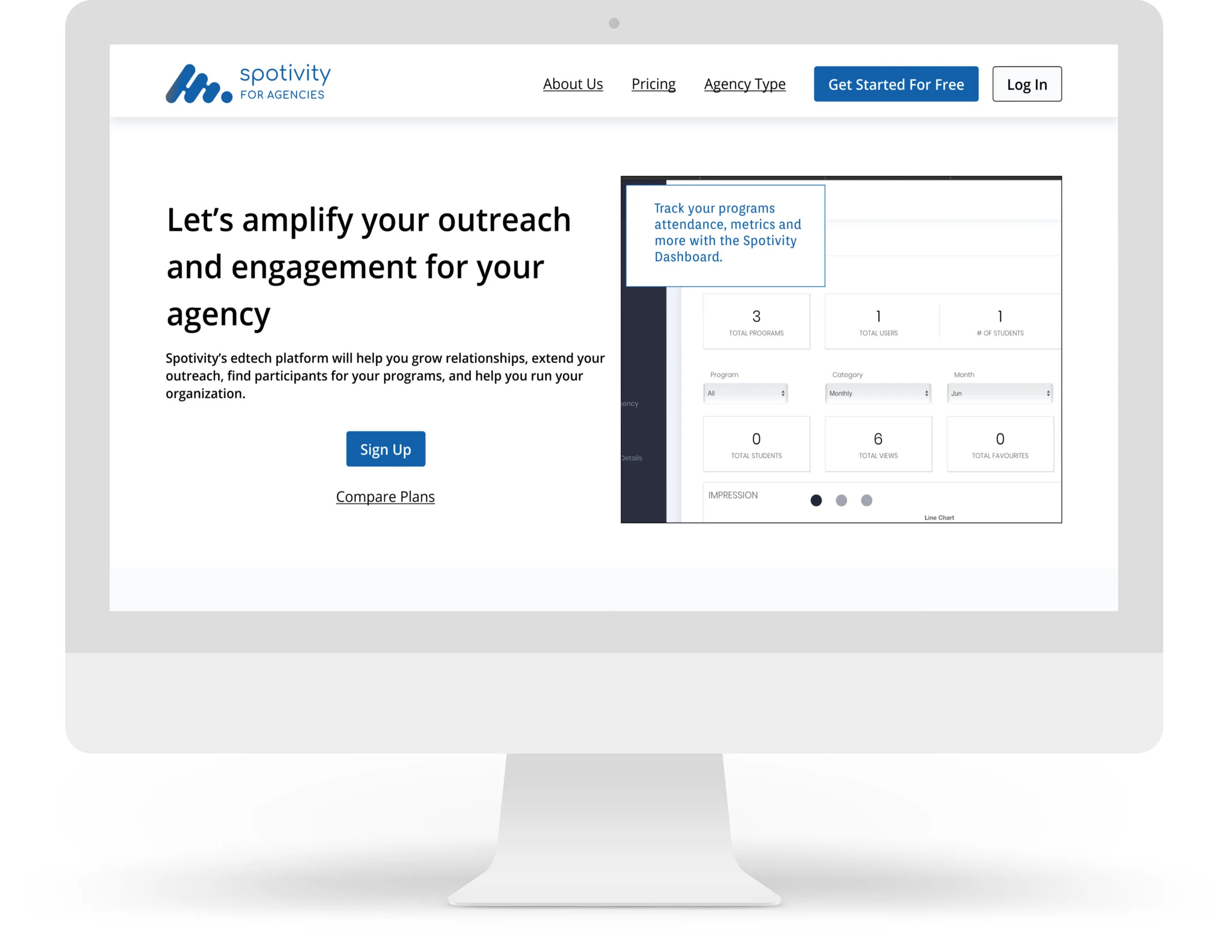
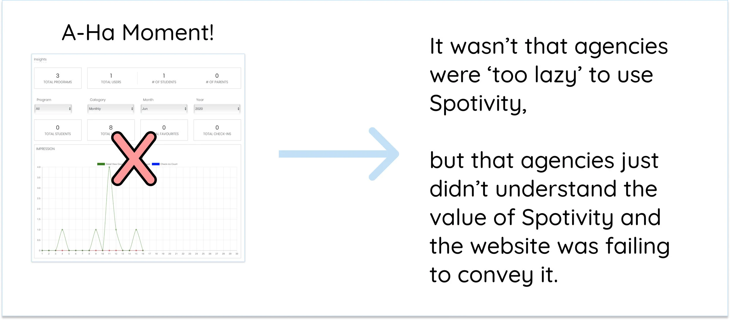
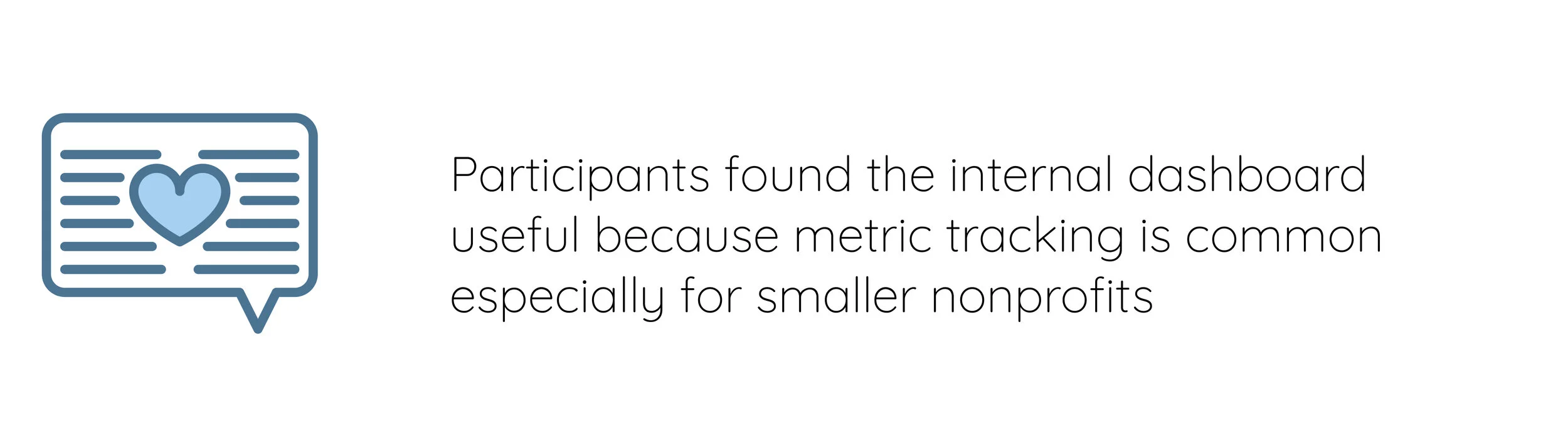
The client felt that in order to appeal to Agencies, we needed to improve the internal dashboard
The client also suggested that Agencies were ‘too lazy’ to utilize this dashboard, therefore by simplifying it may result in more engagement.
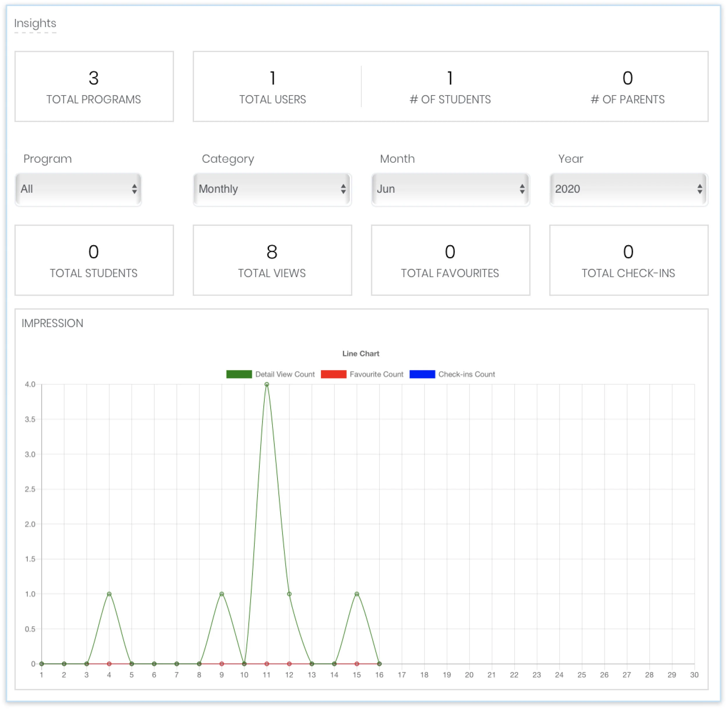
Our client emphasized the focus on this internal Dashboard. We would later discover a shift from this assumption.
The Research *my favorite part.
The following research deliverables were chosen to discover the problems with Spotivity’s existing platform, the needs of their users, and best practices of competitors with dual-sided marketplaces, while evaluated the validity of the client’s assumptions.
Heuristic Evaluation
Competitive Analysis
In order to truly understand the dual-sided platform space, we evaluated leading platforms that served a dual target audience.
Below are the best practices we found that we then evaluated against Spotivity’s existing design.
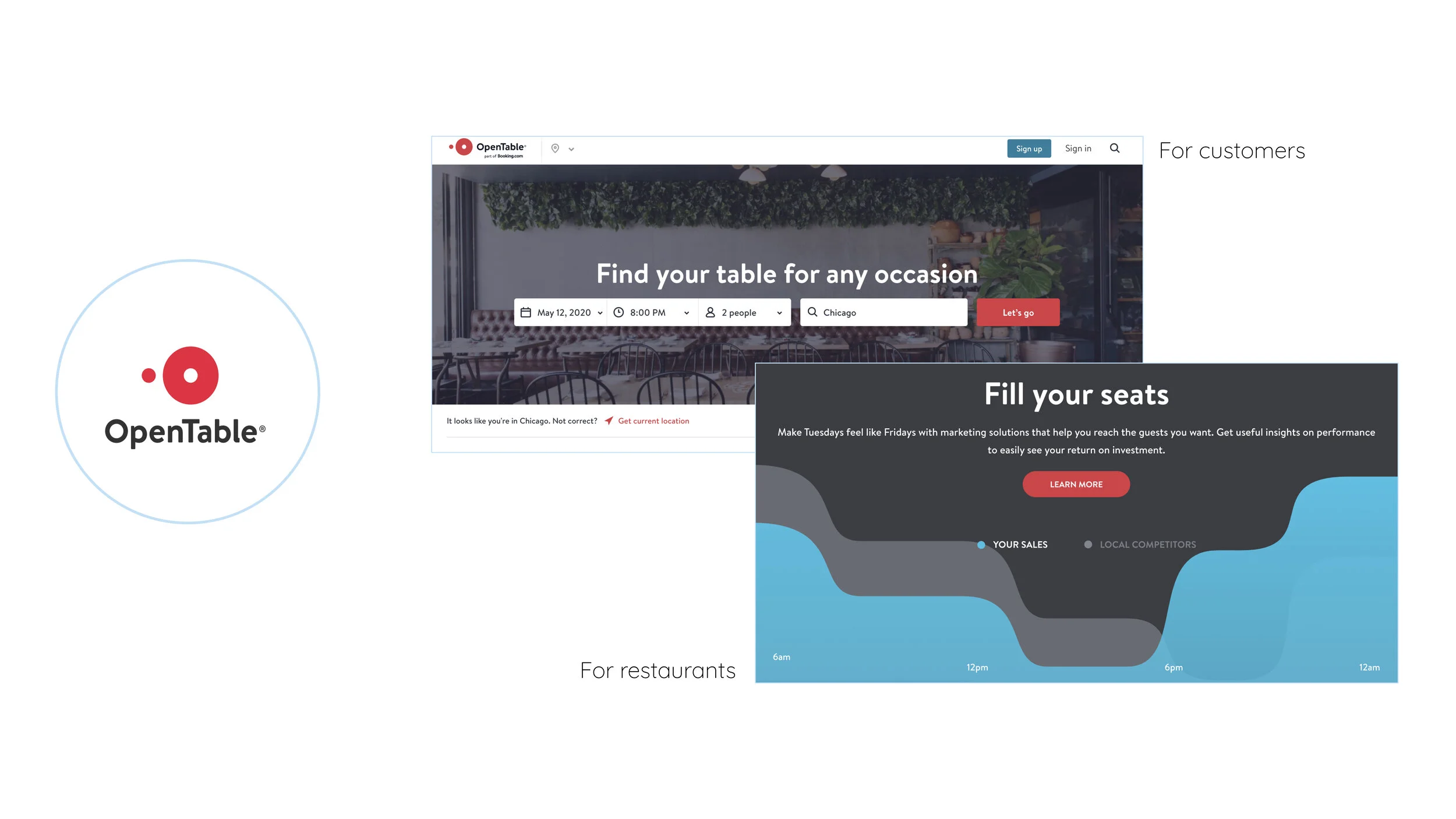
2-Sides in 1:
Platforms such as OpenTable have a visual representation of the two audiences on the platform and guided users to choose one of the pathways to start their journey in that role.
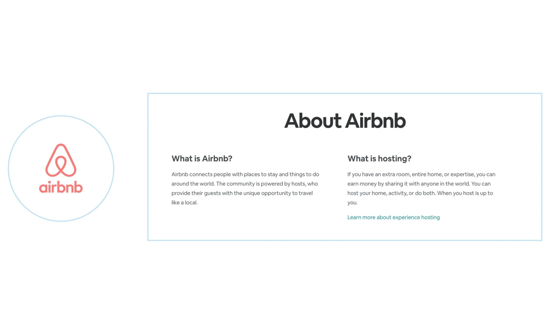
Value Proposition Hierachy:
Platforms such as Airbnb, use minimal hierachy to convey their value proposition, this gradually conveying useful information, while avoiding information overload.
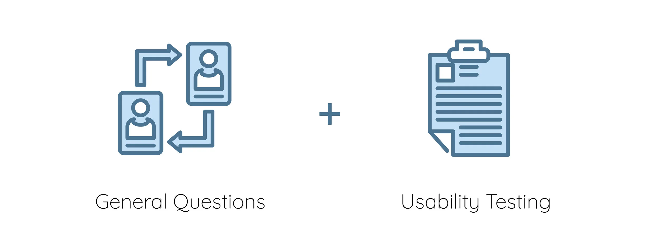
User Interviews
We constructed the interview to consist of two parts:
Why?
By conducting early usability testing at this stage, we were able to build the foundational qualitative and quantitative data of the current website against the client’s assumptions, as well as gain an indepth analysis of agiencies goals and pain points.
Research Discoveries
A Shift in our Scope:
We discovered the true scope of the project was in the ‘pre-onboarding’ of Agencies. This meant everything came before the internal dashboard,
The evidence for this largely derived from synthesis of user interviews with the following insights:
“What is your first impression of this home page?”
Before interviewing, we discovered that almost all our users had little to no experience with Spotivity, despite being members of the platform. And none had experience with onboarding. They had all been onboarded manually through a representative from Spotivity.
This brought incredible value to this question because we were able to learn first impressions and clear pain points from first time users.
This allowed us to define our scope. The dashboard would not be our focus, rather everything leading to it.
“How likely or unlikely would
your agency use a
platform like Spotivity?”
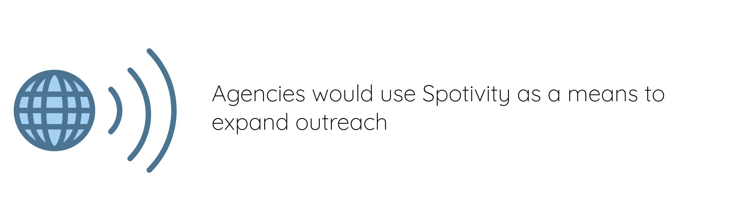
By asking users this question we let our users define the value proposition of Spotivity for themselves, thus understading users’ goals.
but.. what about the Dashboard?
further enforcing why the Dashboard would NOT be in our scope.
Another influential insight we found:
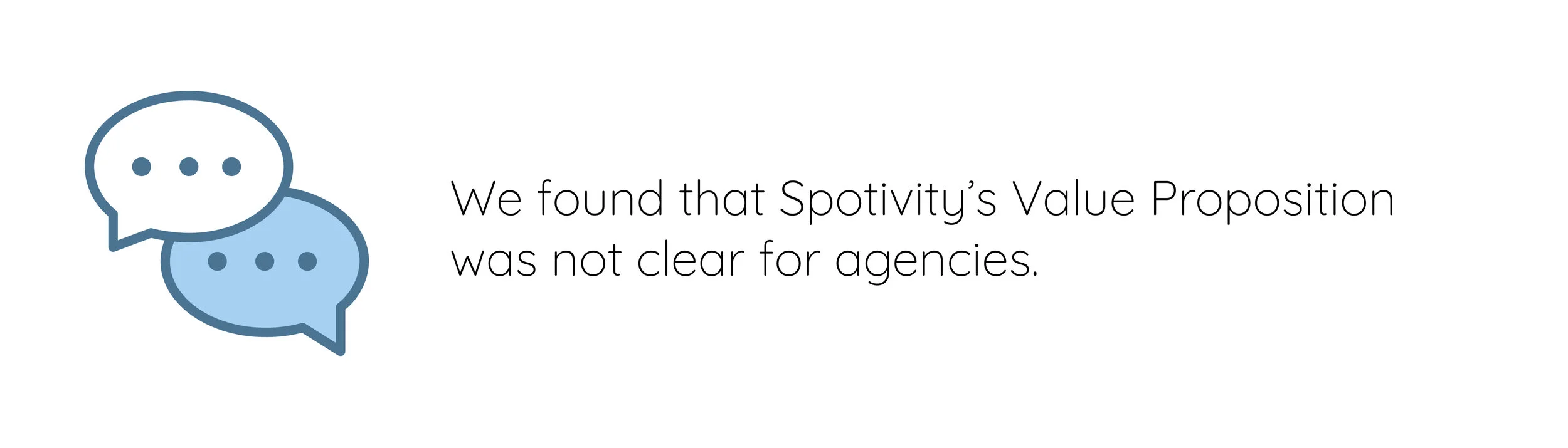
Aligning on the Problem:
We shared our insights with the client and aligned on a precise Problem Statement:
Agencies need an organized and digestible way to understand Spotivity’s value proposition during the pre-onboarding experience on the platform so they can better understand how to leverage Spotivity’s tools for outreach, retention, and promotion of their objectives.
Although, our client still emphasized the value of the internal dashboard, we were able to explain our shift by the enforcing the above mentioned insights. The client was fortunately assured by our descision and we moved forward.
Rooted in this research, we formulated the Design Principles
Ideating possible solutions
Now that our team had established the problem, we leveraged our design principles and research insights to develop divergent concepts.
Although each concept attempts to solve for all our findings, each concept gravitates to solve for distinct problems guided by particular design principles.
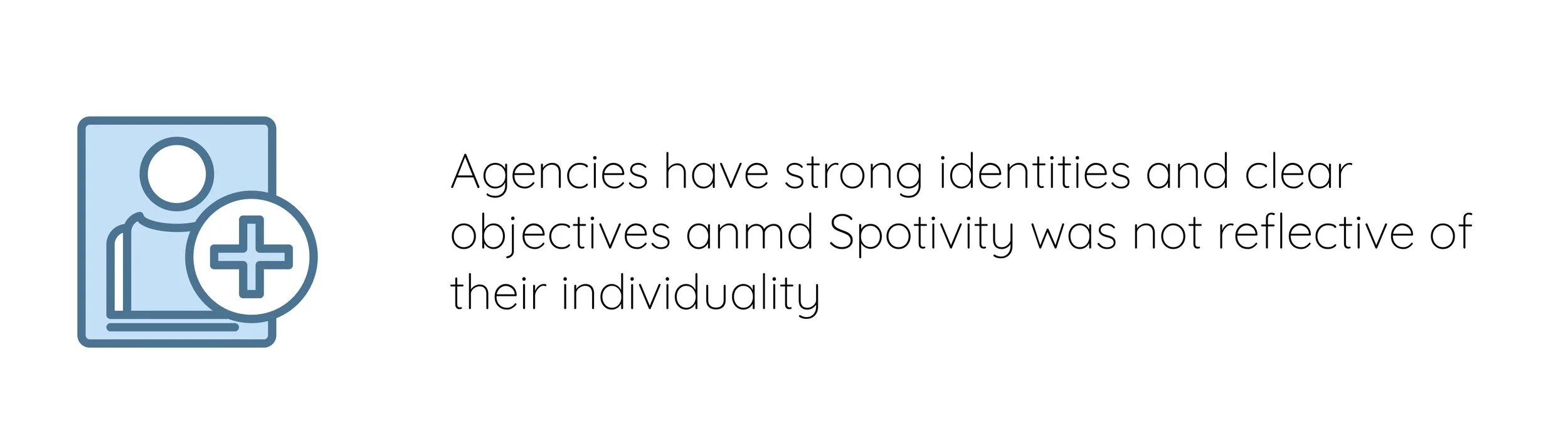
Concept A | Organized Hierarchy: This concept incorporate a distinction of the dual sided by Seamless Guidance. A button at the top right leads users to the Agency side.
Concept B | Navigation by Identity: This concept attempts to provide a solution by honoring Agency Identity in allowing agencies to navigate the website according to their identity.
Concept C | Step by Step Onboarding: This concept amplifies Seamless Guidance by integrating the entire onboarding process through guided navigation.
Convergence for a final design
We assessed the components through concept testing and dissected the the testing-validated designs
In Concept Testing these are a few of the components that tested well: in desirability and usability.
We incorporated these components and merged them through a series of Charrettes until we achieved the final MVP.
The Mid-Fidelity Design
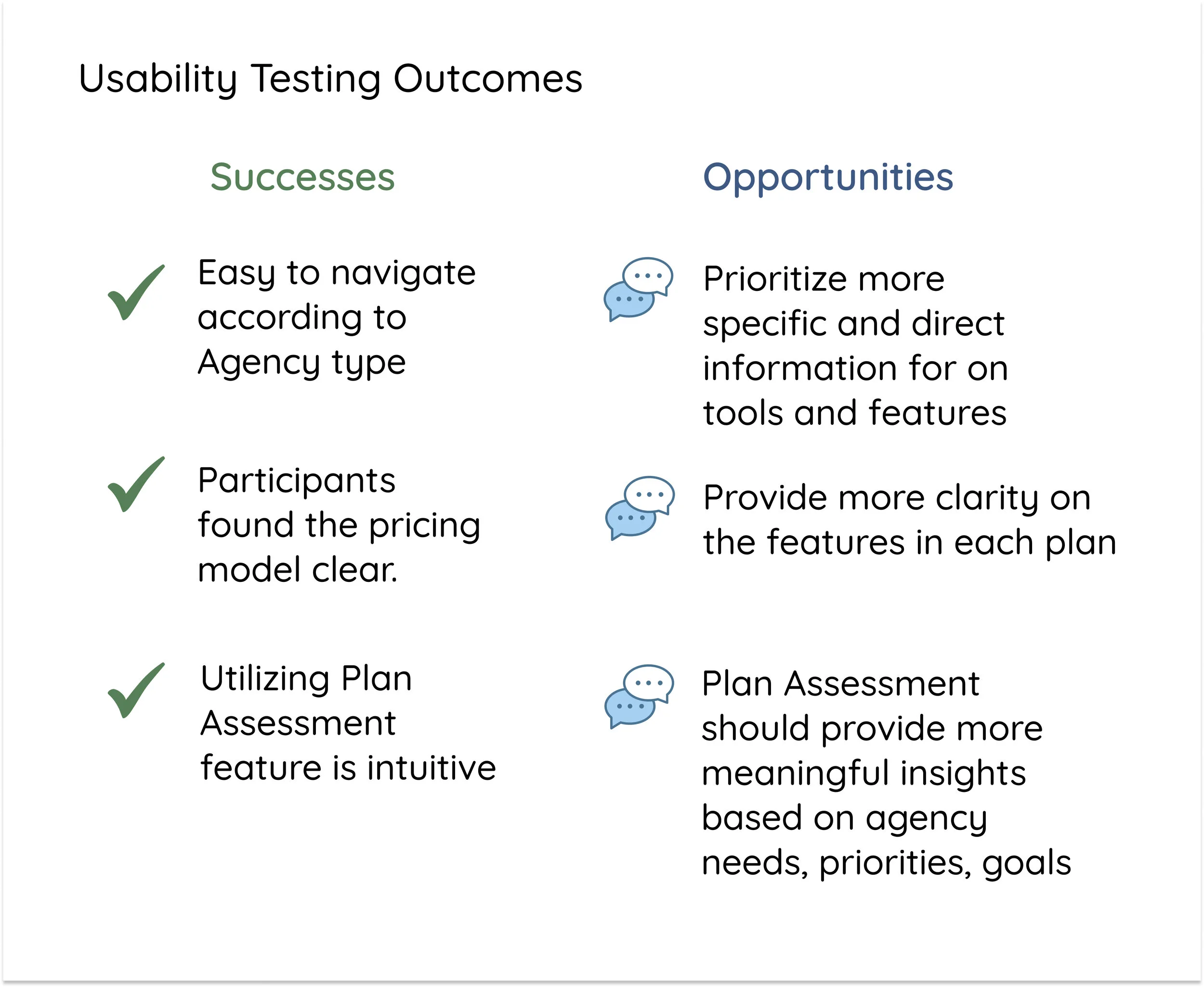
Usability Testing (2nd Round):
We tested a series of tasks to assess the following qualitative and quantitative metrics:
1. Whether the participant was successful in completing task
2. Number of divergent paths taken while completing task
3. Whether the participant felt the task was confusing
4. How well the screens conveyed the intended information
My growth
Client dynamics: Clients are passionate about what they do and determined to improve. As long as we as designers remember that our role— as an advisor is incredibly important to the sucess of the product, we have to be honest in the problems we discover through research, and let that me the guide for our descisions.
Pivot to Perfect: through this project, I had to embrace letting research pave the way. So this meant pivoting in directions, unbeknownst to us when we first started. We had to let our users tell us what’s wrong, not just what we thought was wrong.
icons provided by Payunkead